Designers have a special eye for color, clarity, lines, and shapes. Even that special eye needs the help of tools to go a mile further. Adobe Color is that tool. Apart from writing blogs, I do a little of designing as well. I have designed a few blogs featured images, social media post images, and a few buttons, to say the least, so I know how important it is to pick the right color for any section of the image. If it is a solid color, it’s easy. Any tool can do that. But when it comes to picking a color from a gradient, that’s where the real struggle is. Every pixel in a gradient is of a different color. Picking and replicating the same colors in your image or design becomes cumbersome.
Choosing the right color palette for the whole website is another game altogether. The colors you choose will become the brand colors and grow with the brand. You can’t go wrong there. If it’s Coca-Cola’s red color, it has to be Coca-Cola red; you can’t use YouTube’s color red.
Adobe Color, previously known as Kuler Adobe, helps designers choose the right color palette and identify the existing colors in any gradient. If you open kuler.adobe.com, you will be redirected to color.adobe.com and can play with the tool without any signup. Pick any gradient image from your computer and drop it there in the tool. Go to the ‘create’ tab and then to the ‘Extract’ gradient tab, then drop your image there.
.png?width=1349&name=Gradient-color-extraction-from-image-Adobe-Color%20(1).png)
You can see three dots/steps are highlighting the gradient of the image. Increase or decrease the number of steps from the top-left option. See the image below. You see the RGB value and the HEX number for each color used.
You can even drag the circles on the image to reveal the RGB value and HEX number of that particular spot in the image.
.png?width=900&name=Gradient-color-extraction-from-image-Adobe-Color%20(2).png)
You can choose from 2 to 15 steps. More the steps, the detailed the gradient colors will be.
Under the same ‘Create’ tab, if you go to extract theme, you can pick up to 5 colors from the image that you can choose to make your palette. I am using the same image for the extract theme example. Watch the video below.
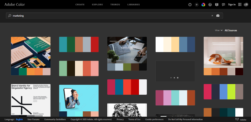
When you go to the ‘Explore’ tab, you will see what other creators have uploaded. You can search either by the color palette you have chosen or any theme. See the below example; I searched ‘marketing,’ and the following results showed up.
Under the accessibility tools, you have a color contrast checker that allows you to see and compare the color of the text concerning the background. It also tells you whether your contrast ratio is good or bad. Bad means that contrast is not good for the eye, and good means it is pleasing and comfortable to read. Here’s a little glimpse.
The Trends tab shows the color palettes trending in different industries such as fashion, graphic design, architecture, gaming, food and travel, and much more.
If you want to save your work in the libraries, simply sign in with your Adobe account and save your work.
Color Adobe is not a fancy tool that does everything, but it does a few things effectively and builds a solid foundation for your designing projects.
No more time you need to waste in asking teammates about any gradient color palette. Go straight to color.Adobe.com and find it in seconds.
Adobe Color is the right way to go for anyone who would like to start their color palette choosing journey. It can’t get any better. As a part-time designer, it has become my favorite one. Try it today.
Working on several companies has given our designers extensive experience across industry niches. Talk to them if you can't decide which color palette you should choose for your website. They'll help you out in logical decision-making.