In any website project you put together there are many options and how you set up your website's navigation is no different. From fixed nav bars to mega menus and responsive navigation to hamburger menus, amoung many other styles, you have options.
It's not that there is a right or wrong way to build out your navigation, it's that some styles work better than others. We explore some stand out and effective website navigation examples below.
Popular website navigation styles
New trends emerge in website navigation each year. As designers get more creative and users become more intelligent and proficient that way navigation can be used is expanding.
Some popular menu styles you will in the website navigation examples below include:
- The Horizontal Header - 5 - 7 menu choices (may have drop down or sub menu)
- The Mega Menu - drop downs with multiple columns of content
- Fixed Scroll Navigation - navigation follows as you scroll down the page
- Static Sidebar - left side, static with important links (popular on news sites)
- The Hamburger - popular option for responsive websites
- Globally Hidden Menus - No visible navigation, can be accessed from a side Hamburger menu
- News article carousel - Usually found below the horizontal header, popular for blogs and news sites.
Examples of Effective Website Navigation
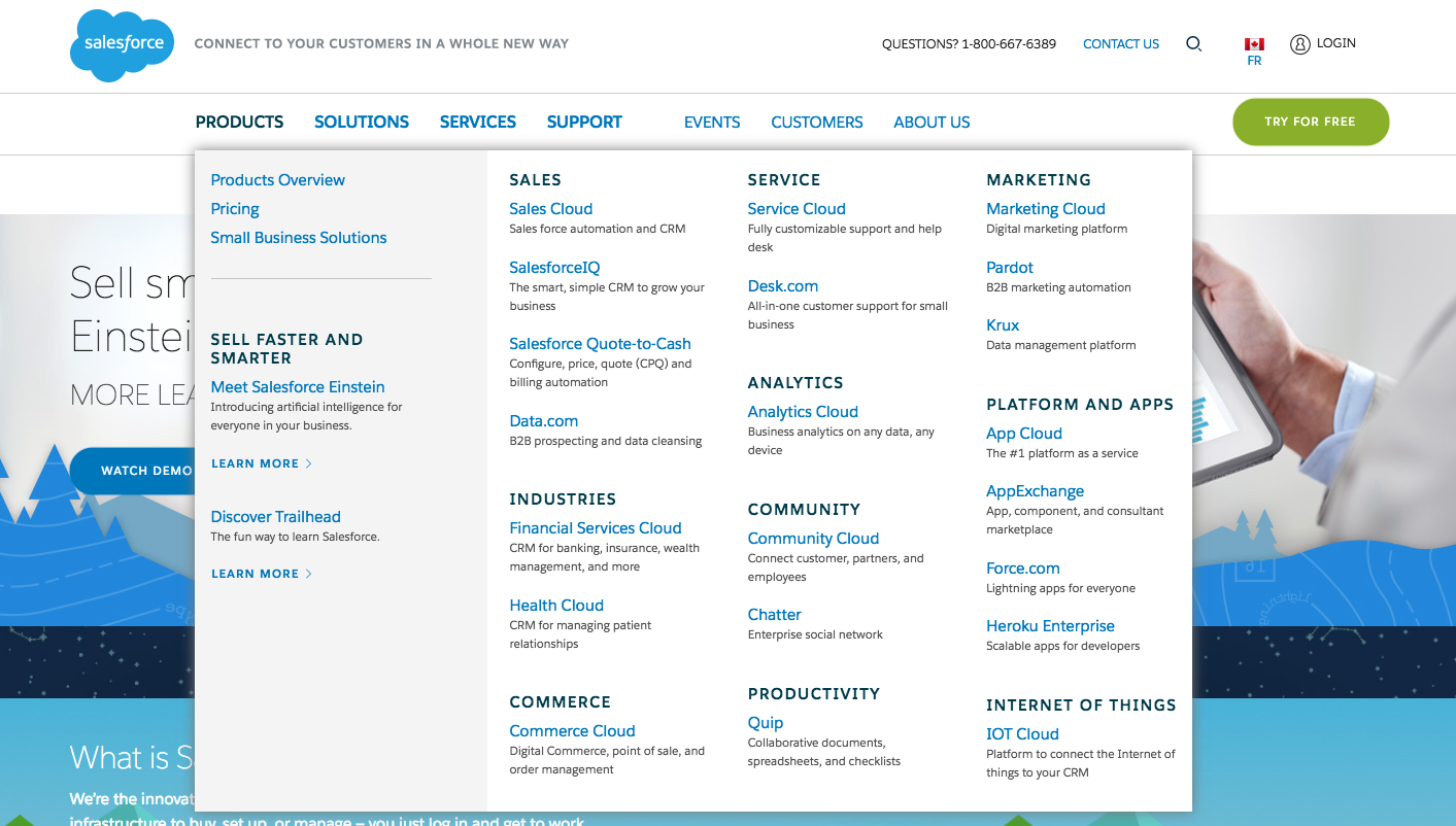
Company: Salesforce
Style: Mega Menu
Salesforce has a lot of content and products and therefore benefits from a Mega Menu style navigation. It's clean, organized and uses a contrasting green to make their main call to action stand out.

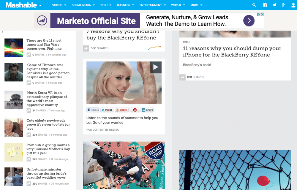
Company: Mashable
Style: News Carousel / Sidebar
Mashable uses the tradition horizontal menu but encourages navigation with links in the sidebar to their most popular articles. Their hero images also incorporates a unique navigation, a headline story followed by three other articles.

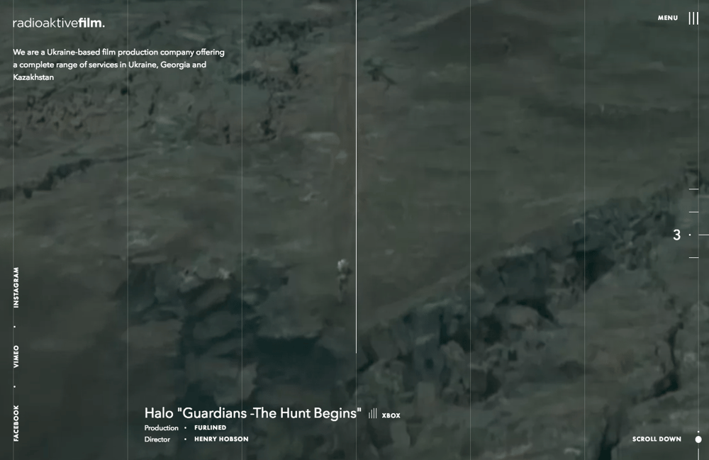
Company: RadioActive Film
Style: Globally Hidden Menu
Radioaktive Film uses their website as a display case for their work. Their page plays quick five seconds versions of the films they've made, navigation in this case would just be in the way of their art.

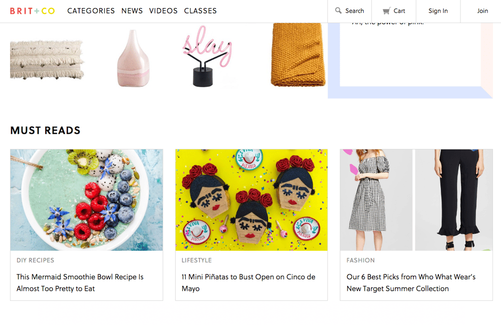
Company: Brit + Co
Style: Fixed Navigation
Brit + Co. chooses fixed navigation to follow their visitors scroll down the page and through their content. Their navigation is classic and clean and allows their visitors the constant chance to get more granular in use.

Company: Tommy Hilfiger
Style: Static Sidebar Navigation
The Tommy Hilfiger global site uses both horizontal navigation and sidebar navigation but breaks down their specific brands using the side bar. Side Bar navigation works really well of portfolio style websites.

The common theme for all of these examples of navigation? They are clean, organized and thought out. Navigation should never be messy, user experience should always be considered. To learn more about effective navigation click here and if you're just beginning a new website redesign project use the free ebook below as a guide to help you optimize your process.


