Let’s rewind the clock to a decade ago. We see an interesting marketing strategy in the Wal-Mart stores and other giant brick-and-mortar stores. An experiment was conducted in a retail store where they placed certain products on the eye-level shelf and observed the sales pattern. Items placed at the eye level or close to the eye level were bought first, then those placed above or beneath the eye-level shelf. That's why brands fight for the right frame in retail stores.
Eye level is Buy Level
A similar concept is tested in digital marketing on landing pages and webpages. Your screen is on the top shelf. Anything you see after scrolling is on the bottom shelf.
Webpages with the most important information, the Call to Action above the website fold on the desktop, had higher conversion rates than those needing scrolling.
Above the fold means all the information is displayed without scrolling the page. Now, you might think that putting everything above the fold would make the webpage messy. But it’s quite the opposite. Knowing there’s limited space, the copywriters carefully choose the words to display the information. They eliminate the fluff and concisely deliver the same message.
The designers then make room for graphics, content, form, and a CTA. Remember to put the most important elements above the fold if your webpage demands more range to give information.
Let’s take another example. In print publications, editors and news writers follow the inverted pyramid method.
The Inverted Pyramid Method
The inverted pyramid or triangle method enables the receiver to receive the most important information on the top. This information is presented in descending order of importance. This feature allows the readers to skim the most crucial details to decide whether to read the whole story.
The Structure of the Inverted Pyramid
This technique uses the formula of 5 W’s and 1 H as follows
- Who
- What
- When
- Where
- Why
- How
The inverted pyramid composition works well for two reasons.
- It is an elite way to attract and keep readers engaged.
- If the story is written in an inverted pyramid structure, no crucial elements will be lost when the reader quits reading halfway without completing the story.
Apart from making things easy for readers, it has been proven a stress-relieving method for editors; since it allows editors to crop unimportant information to fit the story in the column. Also, it is a handy tool for thinking and organizing because it forces the editor to summarize the story's point in a single paragraph.
We all have seen the completely folded newspaper. The headlines are written in bold with the image. Even two important stories are displayed ‘Above the newspaper fold’. People visiting the office can read the news headlines from the papers placed at the stand far from them. Just a few seconds of attention span and the papers still inform enough to the user whether they want to read further or not.

The same principle is applied to webpages. If the user is interested in the information mentioned above, they will surely scroll down for more.
Now, let’s see some beautiful above-the-fold webpage content examples.
1. Shopify
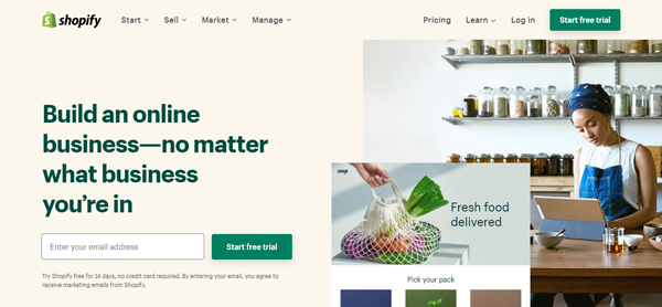
Good use of the space by Shopify. Clean text, relevant images targeting the startups in the eCommerce sector, and a fine CTA for a free trial completes the above fold of the page.
2. Evernote
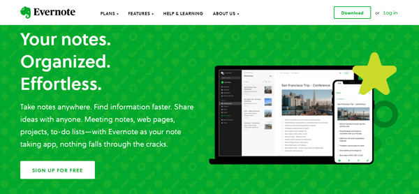
Evernote mentioned all about their product in 4 four words. These are enough for a new user to know what Evernote is about. The subject text below explains some more features. The images on the right side show that it works on Desktop and mobile devices. The sign-up for free CTA would make everybody click on it.
3. PicsArt
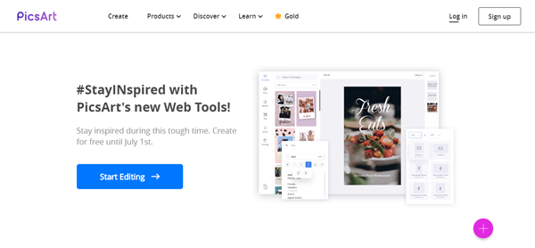
Simple and elegant, with a lot of white spaces, PicsArt displays the editing software interface on the right side. The white area is making the message and CTA pop out.
4. WordPress
WordPress has two beautiful versions. Here's the first one
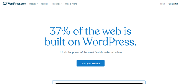
Here’s the second one from WordPress
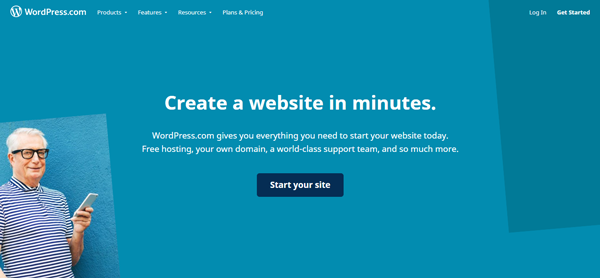
Both versions are minimal. Both look good—the text above the CTA button talks about what every website owner would want.
5. Ahrefs
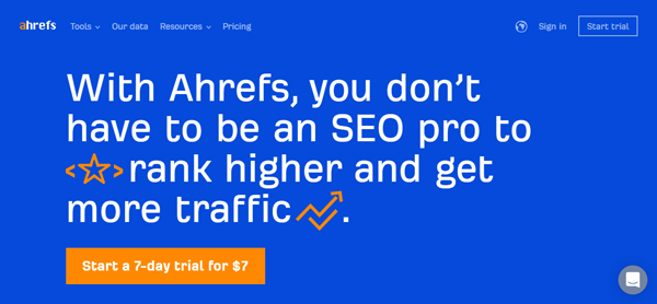
Clear and to the point, just like a newspaper headline and everything above the fold of the webpage.
6. Adobe
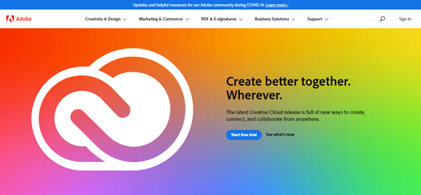
Adobe added a VFX graphic on the page. Offering a free trial is a great move. The users can get familiar with the software. Along with a free trial, Adobe also gave an option to see what’s new - another great edition.
7. Chevrolet
Chevrolet made the screen size slider but kept everything above the fold of the webpage.
I hope this helped you understand the importance of the above-the-fold of a webpage. It's all about eye level - started from print publications and retail stores, it beautifully blends with today's digital marketing.
Download your ultimate guide to agile marketing for free.


